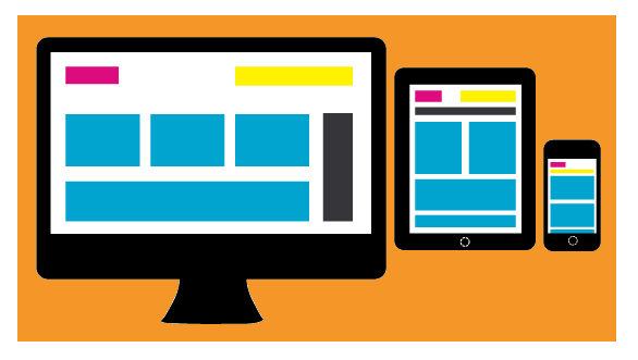
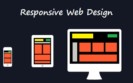
What exactly is Responsive Web Design?
Responsive web design is an approach to web design in which the designer provides an optimal viewing experience – easy reading and navigation with a minimum of resizing, panning, and scrolling – across a wide range of devices (from PC monitor to mobile phone).
Why use Responsive Web Design?
“Day by day, the number of devices, platforms, and browsers that need to work with your site grows. Responsive web design represents a fundamental shift in how we’ll build websites for the decade to come.”
~ Jeffrey Veen
The number of resolutions and screen sizes is growing day by day, and creating a different version of a website to target each individual device is not a practical way anymore. That is the main issue responsive web design addresses.
The three parts of Responsive Web Design are:
1. Fluid grid calls for page element sizing to be in relative units like percentages instead of absolute units.
2. Media queries allow the pages to use different CSS style rules based on the device the site is being displayed on.
3. Fluid images are sized in relative units to prevent them from being displayed outside the containing element. This is often not a good practice and is often preferable to use CSS background images that can be switched by media queries and/or handheld style sheets thus preventing the browser from downloading images that are larger than what it needs to render.
To be continued…
Do you want a Responsive Web Design for your website? Get a free quote today!