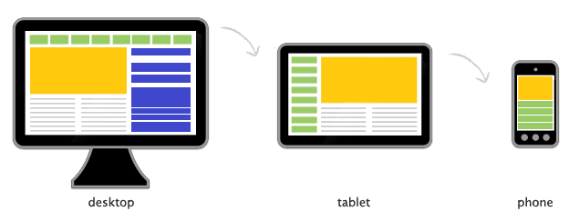
Step II in Responsive Web Design is the use of Media queries. Media queries are supported in Internet Explorer 9+, Firefox 3.5+, Safari 3+, Opera 7+, Chrome 5+, as well as most smartphones and touch-screen devices.
Media queries allow the web designers to create conditional stylesheets based on width, height, color, orientation, and many more. Media queries allow pages to use different CSS style rules based on the device displaying the website and they expand the role of the media attribute.
Setting conditions in media queries:
| Feature | Value | Min/Max | Description |
width |
Length | Yes | Display width |
height |
Length | Yes | Display height |
device-width |
Length | Yes | Device width |
device-height |
Length | Yes | Device height |
orientation |
portrait or landscape |
No | Device orientation |
aspect-ratio |
Ratio (w/h) | Yes | Ratio of width to height |
device-aspect-ratio |
Ratio (w/h) | Yes | Ratio of device-width to device-height |
color |
Integer | Yes | Number of bits per color component |
color-index |
Integer | Yes | Number of entries in the output device’s color lookup table |
monochrome |
Integer | Yes | Number of bits per pixel in the monochrome frame buffer |
resolution |
Resolution | Yes | Density of pixels of output device, (integer followed by dpi or dpcm) |
